Mobile Responsive Websites
Mobile is a Priority 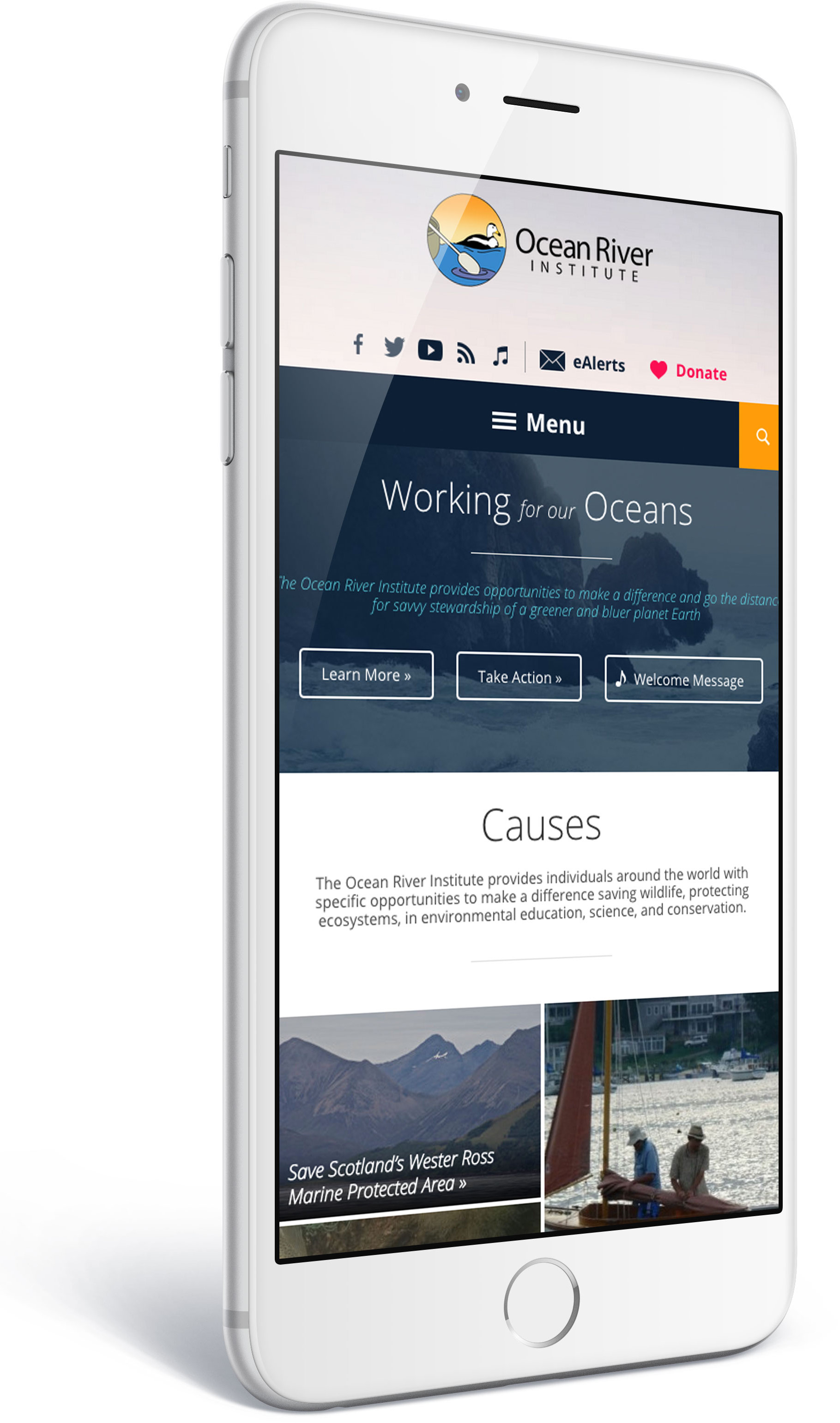
Mobile visitors now account for nearly 30% of all site traffic. As more people use mobile devices to access information online, designing for these users is necessary for well-functioning websites.
Additionally, Google, the gold-standard for online search, now includes mobile responsiveness as part of its search rankings.
RainStorm Builds Responsive
We develop a mobile layout for every custom site we create. Our websites automatically detect a visitor’s screen resolution to provide a beautiful view for smartphones, tablets, laptops and desktops. This gives all visitors an optimal experience regardless of device.
Crafted to be Mobile-friendly
If your website isn’t responsive, we can create a responsive view or mobile version for your website, making it mobile-friendly and ready for anything! If you don’t have a website yet or are considering a new site, we build mobile-friendliness into every new WordPress site we create.
The needs of a desktop are different from those of a tablet which are different from those of a smartphone. Our team never phones it in – our responsive sites are carefully designed to give visitors an excellent experience for their screen size.
If you want a site ready for the big screen and the small screen—we can help!
Ready to get started?
We would love to talk to you about your next website — call or message us today to see how we can help you.