Color Palettes & Websites: A Brief Overview
Color is an integral part to our everyday world, and it will be an integral part to your website, as well. Every color we see invokes a different and particular emotion based on our experiences and the way in which it is used, meaning that there’s some psychology behind best practices when it comes to designing with color. With your website, multiple colors will be deliberately chosen to highlight your brand and contribute to the best possible user experience, so stick around to learn about the basics of the interactions of colors and color palettes in websites to see how you can help your website meet your business goals.
What is a color palette?
A color palette, in terms of design, is a concise visual collection of your brand’s colors. This definition will be used in the context of your website, so beyond the colors of your logo, it will also include supplementary colors in your website that either provide a notable contrast or a comparable tint or shade of your original colors.
Why are color palettes important?
Color palettes are helpful for a variety of reasons, but let’s start out by talking about the design process of a website. When you provide a web designer with a list of colors in your branding but also colors that would work well with it from a web standpoint, that puts the designer at a considerable advantage to be able to communicate your branding throughout the website. It can help avoid an over-emphasis on plain black & white – which is not in and of itself a bad thing, but allows for your website to show your unique character if you are able to choose other colors outside of the obvious. Once that color palette is created, this helps go beyond your initial website design and allows for all other aspects of your marketing, whether it is print marketing or social media marketing, to incorporate those direct and specific colors into your content for better brand cohesion. Taking care to choose the right colors to be displayed in a website keeps your website from either creating a headache for all viewers, or not being attractive enough for your visitors to stay. Color is a powerful and effective tool to evoke emotions out of your audience, so take time to choose your color palette wisely to properly accomplish your website’s goals. If you would like to read more about basic website color theory and psychology, take a look at this article.
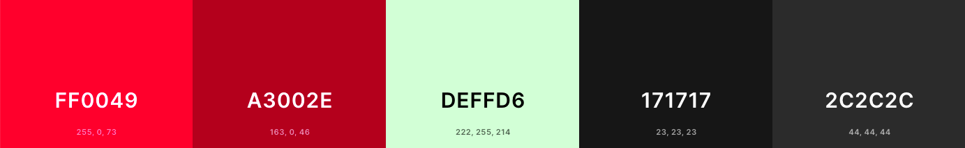
Here’s an example of how you can expand your color palette outside of your initial logo color and black & white…
Imagine this vibrant pink was the sole color of your logo. You’d probably be fairly excited that beyond black & white text, that you could use pops of pink throughout your website. That is a great idea! Here’s where you would start with your color palette:

However, once you start to see this play out in initial mockups of your website design, you might feel your website feels a little 90’s, despite a great layout with lots of pictures, all of the rest of the text seems to have “one note”. Even if highlights and link colors are made to be the vibrant pink color, there may seem to be something missing from the overall feel of the website. If you define the dark colors of your website to be your favorite shades of dark gray as opposed to stark black, and add a complementary cool green tint of white in addition to using true white throughout, you’ll have a more dynamic color palette that offers more options to the designer.
The truth is, defining other colors besides black and white actually have a calming and welcoming effect when it comes to your website. It is not only easier on the eyes, but brings in a modern feel that you want to have when your web audience visits!
Color palette vocabulary
Before going too much further into more color palette best practices, it may be helpful to define some vital design terms that can help you start to think about what colors would be most beneficial for your website color palette.
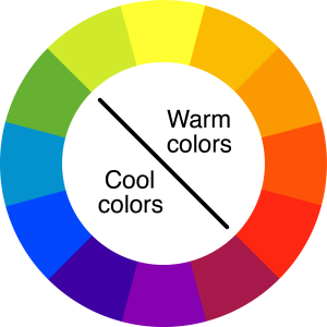
Cool and warm colors
The difference between cool and warm colors is what side of the color wheel a particular color would fall on. You would think of red, orange, and yellow are warm colors as they evoke some sort of heat, boldness and passion. You would think of green, blue, and purple as cool colors as they evoke feelings of natural objects that are cool to the touch like grass and ice and provide a calming effect. Here is a simple graphic that displays the two:
Complementary colors
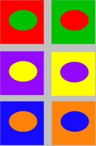
Thinking within that same color wheel, a complementary color is the color that is exactly opposite from your chosen color. For example, blue is complementary to orange, and green is complementary to red.
Tint/shade
When you think of a base color, say red, there is a considerable difference between a dark burgundy red and a light pink red. That’s where the definition of tint and shade come in. If you add white to a color, you create a tint. If you add black to a color, you create a shade.
Saturation
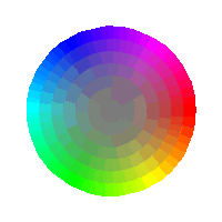
Saturation is the official term for describing the intensity or vibrance of a color. As you take away the color, you come closer to gray. The further away from gray you are, the more saturated the color is. In this graphic, the center is least saturated and the edges of the circle are most saturated.
RGB and hex
RGB and hex are both terms in which the web developer will specifically use colors in your website. RGB, which stands for red, green and blue, is the modern way in which colors are used on screens where colors are created by adding colored light to black. You may see them in brackets like: (255, 255, 255) which is the RGB code for white. However, originally screens used a hexadecimal system to represent color on more primitive screens which is a mathematical calculation. They are represented by 6 characters following the “#” symbol. For example, the color white would be #ffffff. While there could be a lot more of an in depth description of why these particular methods are used to define colors on the web, what’s more important is that you are familiar with the format. If you can find your brand’s colors in terms of either RGB and hex values and provide them to your web designer, that would be most advantageous for you and them!
Hopefully the definitions of these terms will help you be able to better communicate to your graphic designer or web designer what you hope to accomplish with the creation of your website color palette. When you are wanting to describe whether you hoped a color would come across more vibrant or muted, reference these terms to be able to accurately describe what you are looking to change in terms of your website color palette.
Example of a website color palette
If you are wanting to know a prime example of a brand and website that utilizes the modern best practices of a color palette, Walmart.com is a masterclass in good contrast, pops of color and easy-on-the-eyes shades of black and white. Those 3 objectives are what you should be searching for when creating your palette. First, see an example of the website homepage.
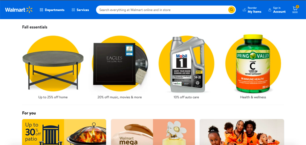
The background is stark white which means that any colors placed on top of it will be easier to read. The text is not in a true black, however, and you can see that it is in more of a graphite gray. This keeps the user’s eyes from straining while reading text. Bright blue is Walmart’s main brand color, which is reinforced by keeping that blue menu sitting on top of the page at all times and is a constant reminder of the brand you are shopping at. Additionally, the yellow as used in their star symbol is not only used as photo backgrounds to provide contrast, but also in icons so that when set against blue, the yellow is a direct contrast to your eyes to draw attention. If you had scrolled further to the bottom of the page, Walmart also uses a lighter tint of blue to provide an additional option to display brand colors without the bright blue being overused. Walmart’s color palette can be condensed to the following:

Included in the palette are the two main brand colors, bright blue and yellow, along with their definition of white and off-black, and the additional shade of light blue to differentiate from all bright colors.
Tools for creating a website color palette
While you can certainly find the hex values for all of the colors you are thinking of using in your website color palette and design a wonderful custom graphic in Photoshop all by yourself for your web designer to use, that is not necessary and certainly not expected of a business owner when it comes to providing your web designer with needed content for the web design process. In fact, the Internet has provided so many tools in creating color palettes that it would take you just minutes to find your initial brand colors, add your other colors, then download for immediate use to be sent off to a web designer and any other marketing professionals on your team. The following 2 tools are free and easy-to-use for anyone:
Coolors
Coolors.co is a color palette generating website that can be used for finding inspiration for color palettes when you’re feeling in a rut, but most importantly a great way to see all the colors next to each other in testing. You can switch easily between different modes of measuring color (whether it be RGB, hex, CMYK and more), and you’ll be able to drag-and-drop to compare colors to each other most efficiently. Once you’ve created a website color palette you’d like to send to a web designer, just download and email it over!
Canva color wheel
Canva is one of the leading graphic design tools for creators and consumers alike, with many great templates and more importantly, great design theory and tools for designing. One of their better tools is the Canva color wheel, which allows you to start with a base color and by selecting a couple of additional requirements, will create a color palette for you. This is particularly great if you are looking to start branding your business at the beginning stages, or if your brand only consists of one color. This will allow you to research colors that are compatible, and of course, be able to download the final color palette at the end for accessible use.
While this is a brief overview of why color palettes are important, how you can create them, and how you can critique them for your website, the responsibility of great design for your website does not rest alone on your shoulders. This is a great jumping off point to have fruitful conversations with your graphic designers and web designers that help your business. With RainStorm, all of these considerations are made as we approach each website design project for your business. We encourage you to reach out to our team to see how we can help address the topic of color as it pertains to your website, along with any questions you might have about the web design process.