Case Study: Making the MDIBL website look great on a mobile phone, for a fraction of the cost
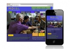 The MDI Biological Laboratory communicates with students, partners, and the community via a fully-featured, modern website online at mdibl.org. When MDIBL recognized an ever-increasing list of website visitors arriving from mobile devices, they turned to RainStorm Consulting to build a mobile version of their site.
Rather than develop a completely separate version of their site — at more cost to them, with more maintenance time and effort required — we revised their existing website to automatically adapt itself when viewed on a mobile phone.
You don’t even need a smartphone to view the results: Just go to mdibl.org, then re-size your browser window narrower and narrower. You’ll notice the site design automatically adapts, re-organizing to adapt nicely for display on a smartphone.
This approach to serving mobile visitors, called responsive design, is an increasingly attractive option for site owners who recognize the need to serve their audience with mobile devices while also looking to keep their maintenance time and costs in check. Keep it in mind the next time you consider how many of your visitors are finding your site from their phones.